
Tips for Choosing the Perfect Shade of White Paint for Your Walls
Thinking of painting your apartment white? You wouldn’t be the only one. White walls tend to make spaces look brighter, more open, and bigger than they actually are.
They also provide a clean, minimalist backdrop for art and furniture, making them a beginner decorator’s dream.
However, it’s not as simple as walking into the paint store and choosing the first shade of white that catches your eye. No white paint looks the same in two places. Plus there’s about 5,000+ shades to choose from.
We’ve broken down the most important things to keep in mind while you’re shopping for white paint, and listed some of the most popular choices below.
5 tips for choosing the right shade of white paint
1. Consider the whole spectrum of white
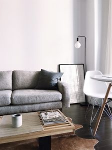
Cool whites generally have blue undertones, making a space look clean and crisp, while also allowing statement art pieces to stand out. They complement other deep blues, purples, and greens, and look great in rooms with lots of natural light.
E.g., Sherwin Williams’ Pure White or Benjamin Moore’s Decorator’s White
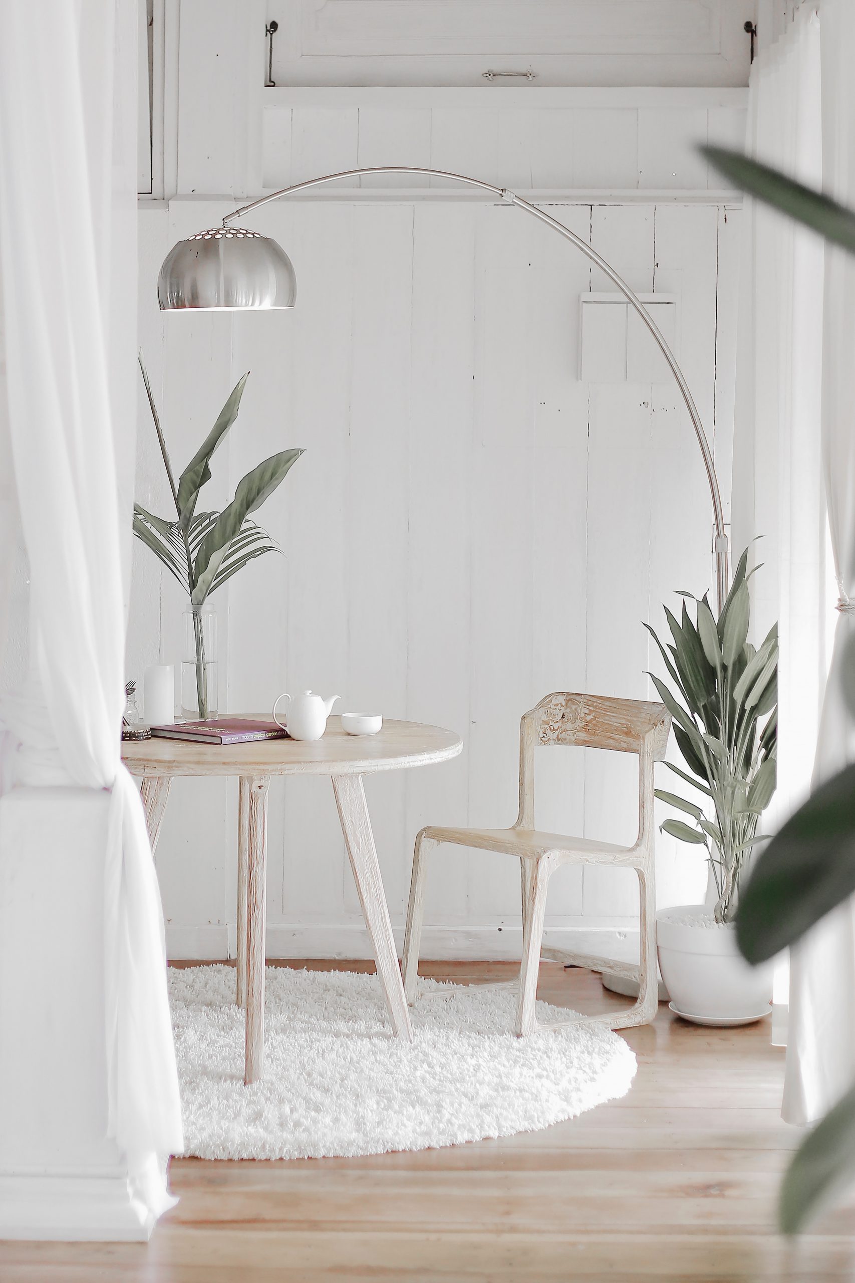
Warm whites are mixed with yellow or red. They provide soft, welcoming vibes, and look good in rooms with lots of neutral tones and wood furniture. Think cream vs. chalk.

E.g., Sherwin Williams’ Dover White or Benjamin Moore’s Simply White
Pure whites are the most versatile of the white shades, as they have the least amount of undertones. They contribute a modern feel to any space, and complement other bold colors in the room. If you have a very eclectic style, pure whites may be the best choice for you. However, with too many other neutral pieces, this color may begin to look sterile and uninviting.

E.g. Sherwin Williams’ Extra White or Benjamin Moore’s Chantilly Lace
2. Test the same shade in different rooms
It’s ideal to use the same shade of paint throughout your whole apartment for a continuous feel (it also makes touch ups easier in the future). But sometimes, depending on the lighting, flooring, or furniture, one shade of white will look good in one room and too yellow or blue in another.
Ask your paint store for 9×12 painted swatches of white, as the tiny ones provided in store will barely help you test at home. Then hang them side-by-side in all the rooms of your apartment. You may end up choosing a slightly different shade of white for a room that has no natural light, or just going with one shade that generally looks good in all the rooms.
3. Test the same shade at different times of day
Leave your paint swatches up for 24 hours and note how different they look throughout the day. Perhaps one warm shade looks good in the morning when there’s lots of natural light, but begins to look too yellow-y when the light fades by afternoon. Maybe your pure white looks too sterile at night when not mixed with any natural light.
4. Consider the lighting
Does your lighting have a lot of blue in it? This may have the unfortunate effect of giving white paint with yellow undertones a green tinge.
Pink tinted light may make cool whites appear a bit purple. Harsh white light may make pure whites appear blindingly white.
If your apartment has lots of natural light, consider that Vancouver’s natural light often has grey undertones, which makes it a great pairing for cool whites with grey undertones.
Make sure to test all your paint swatches with both the artificial and natural lighting in your home. They won’t look the same as they do in the store.
5. Consider the furniture
If you have lots of heavy wooden furniture, or any furniture made out of natural materials like marble, granite, linen, wool, warm whites are often your best bet. Big bold pieces like a lavender couch or navy blue bookshelf may call for cooler whites.
Test your paint swatches near the largest pieces of furniture in your home to see which white complements them best.